
Blog
Join me to reflect on art and life.
What’s this Patreon thing?

You have probably seen me mention my Patreon channel, but have you checked it out? Patreon is one of a few membership sites that allows creatives of all kinds to share exclusive content with their patrons.
Patreon has become the online home for my Arty Gang. Every artist needs a community to support and inspire them along their creative voyage. In exchange I share exclusive art lessons and so much more. There are several posts you can check out right now without a membership, but I would love if you joined my Gang!
Fit to create
As a working artist of a certain age, I have come to realize that their is a physical aspect to my ability to create. I call this creative fitness, but don’t get scared. The only marathon involved is a marathon of painting.
If you are sitting at a desk or standing at an easel for multiple hours, you need a creative fitness routine. I recently found a doctor of physical therapy on Instagram. Dr. Jacob VanDenMeerendonk. I love his page because he has stretching and mobility exercises for every muscle group. Whatever I am feeling that day, I can find something. They are simple routines that allow me to work comfortably. It does not take long to complete each day and it can have a huge impact on your creative practice. Want to join me?
Disclaimer: I am not a doctor or physical therapist. This are stretches I do that work for my body. If you have any injuries or ongoing health conditions, I recommend discussing this with your doctor before starting any fitness program.
Here are a few of my favorites….
Happy fit arting!
A history of color….black
“I’ve been 40 years discovering that the queen of all colors was black.”

I recently started reading a book by Victoria Finlay , “Color: A Natural History of the Palette”. I have wanted to explore the history of color, but this book is a much deeper dive than I was expecting. I am very spoiled by going to an art store and buying any color I want. Of course I mix and blend those colors, but I never thought of the expertise needed to make paint from materials around you.
For example, I never thought about the effects environment had on colors used by artists in different regions. Before easy world travel, an ochre in Italy was wildly different from an ochre in Australia. Every region had different formulas using the plants, rocks and soil of their area. Even the pH of an area influenced the colors you could achieve.
I tend to think of black as a basic color, but I have learned so much. Black was the first color used by artists. You can imagine someone sitting around a fire in a cave, grabbing a burned stick and realizing that the charcoal allows them to draw on the cave wall. The earliest drawings usually include some form of charcoal. Later the Greeks and Romans used black silhouettes on all types of art, pottery and homes. The color itself has had many meanings over the years - from affluence to nobility to death to evil.
When we walk into an art store, we can see so many blacks….Ivory Black, Lamp Black, Bone Black, Iron Oxide Black. We all have a favorite black to use, but do you know how they each got their names?
Ivory Black originally came from burned scraps of ivory. It is considered one of the finest blacks by artists. Fortunately now ivory is protected, so the formula used is closer to Bone Black with finer particles. Bone Black comes from burning animal bones in an airtight container. Lamp Black originally came from lamp soot.
As for modern blacks, Anish Kapoor bought the rights to Vantablack, the blackest black. Another artist, Stuart Semple, was upset by Kapoor’s refusal to allow other artists to use Vantablack. He started a Kickstarter campaign for Black 3.0, which can be used by anyone. Who knew there was a global chess game to obtain the blackest black?
I personally like to use Carbon Black. I find it is dark enough for my uses and it makes many lovely shades of gray. Do you have a favorite black?
My 8 things…podcasts
I enjoy listening to podcasts while I work and when I am in the car. I usually lean towards art or creative podcasts, but there are also a few motivational ones too. Here are my favorite 8 right now…

Daily Boost
Paint Stories with Mark Golden
Focus on This
The Inspiration Place
Happier with Gretchen Rubin
Show Up or Shut Up
Get Messy Podcast
A Maker’s Story
You can find these on your favorite podcast app. Do you have any favorites I should try?
15 Minute Journal
Two years ago I started a personal challenge, a journal page in 15 minutes. I decided to record these sessions and post them on YouTube. I have been thinking about this book lately and am thinking about trying this challenge again. I liked that it was a set amount of time, so I couldn’t spend alot of time looking for the “perfect” thing. I had to just grab what was at hand. I believe that this challenge changed how I create. I now work must faster and I am less obsessed with finding that “just right” thing for a page.
Have you checked out this series on YouTube? Should I do it again?
Did you start a creative challenge this year?
Last month I talked about different creative challenges and why it’s good to take on a challenge. I also told you about my sketchy success rate. Well, it’s happened again.
This year I decided to do the 100 day project again since it was such a success for me last year. I decided to do 100 days of color palettes, using lots of colors I don’t normally use. My logical brain said this was a great exercise to help me expand my palette. Unfortunately, my creative brain did not agree.

I started out great. I selected a main color for each week of the challenge. I cut out 100 small cards to hold my palettes. I even finished the first week and then….. my creative brain took over. I wasn’t excited about my palettes, so I always found other things to do. I tried a few days to catch-up, but about day 30 I just gave up.
After feeling bad for a few days, I thought about why it had been unsuccessful. I realized that I had picked a project I “thought” I should do. My logical brain thought this was just what I needed, but it forgot to consult the rest of my brain. One of the reasons I was not excited about my project was that I had not planned what the palettes would look like. After a few days I realized I would like them more if I had made them like swatch cards, but I had already started another way. (Don’t ask me why I couldn’t just change in the middle of the project.) I also realize that I would probably enjoy it more creating larger palettes once a week, instead of daily. By the time I get all of my supplies out, it seems a waste to just create one little palette card.
Although I didn’t finish 100 days (heck, I didn’t finish 10 days), I learned a few things. Number one….make sure the logical brain holds a meeting before making any decisions. Number two…I enjoy making palettes, so I’ll dedicate more time to it once a week. Number three…if I choose to do the 100 day project again, think about what I would want to do every day. Keep it simple.


Re-think your stamp collection

I have been having alot of fun playing with Dina Wakley's Gloss Sprays. I have tried them on different surfaces and even on my gelli plate. One thing I love is that I can create a quick background in my journal without having to gesso. You can layer and color mix all you want and they dry to the perfect glossy finish.
I was inspired to create this page using the new Gloss Sprays and using stamp sets in new ways.

This page started with a background of blue sprays
(Turquoise, Ocean and Marine).

After allowing the first layer to dry I came back with the spray in Night, both sprayed directly on the corners and through a stencil.

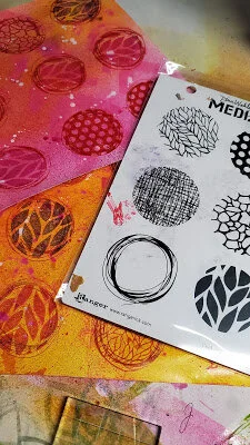
While the background was drying, I created some pages for stamping. I wanted to use Dina's "Circle Patterns" stamp set to create some abstract flowers. I also wanted to use her "Funky Journal Shapes" stamp set to create some leaves. I used three sheets of Hammermill Premium Color Copy Cover paper. I sprayed two sheets with a mixture of Magenta, Fuchsia and Lemon. The third sheet was sprayed with a mixture of Lime, Olive and Turquoise.

When these sheets were dry, I stamped the "Circle Patterns" set in Magenta and Vermillion Ranger archival ink on the pink sheets. Then I stamped the leaf shape from the "Funky Journal Shapes" on the green sheet. I used Garden Patina and Sap Green Ranger archival ink for this sheet.

Then I cut out the leaves and flowers.

I also stamped the face from Dina's new "Fierce" stamp set on a sheet of blank Collage Paper using black Ranger archival ink. Once stamped I cut this image out, removing as much Collage Paper as possible.

I glued the face onto the left side of my background page using Dina Wakley Media Gel Medium. Once dry, I used Caran d'Ache Neocolor II pastels to draw in a face shape and neck.

Using Dina's Ultra Thick Gel Medium, I began gluing the flowers and leaves in layers around the head. Several flowers and leaves were trimmed to carry the design to the right side page. I also left some of the flowers hanging off the top of the page, instead of trimming them even with the page.

I am really happy with the outcome and I enjoyed using the "Circle Pattern" stamp set to create abstract flowers. This reminded me to look at my stamps and think of new ways to use them.